

The latest news in the stock market is tough to swallow, but hardly new to most folks who follow such things. I wanted to get a better historical perspective, so I pulled up a table of the S&P 500 Index, a highly watched measure of a diverse range of stocks, along with the historical Consumer Price Index, to see what I could learn.
I was interested in different periods of time, looking back over 10, 20, even 50 years to see what the data showed.
If we look at the direct index returns (below), excluding dividends, over different look-back periods of time, we can see that despite the ups and downs, the long term return has been pretty stable at between 5 and 7.5 percent. The thin green line is the 5-year return that wiggles a LOT, but the thick purple line, the 50-year line, is pretty stable. Things are pretty stable even for 30- and 40-year look-backs.
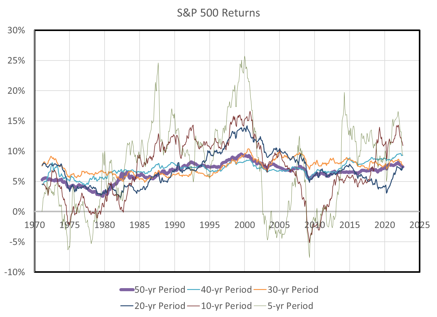
So, using a 6 to 7 percent average stock market return is not a bad choice for planning purposes (and this post is neither advice nor a forecast, but just looking at what has been true in the past, which is possibly our only guide to planning).
Next, I did the same analysis for the Consumer Price Index, calculating an inflation value for different look-back periods. Here again, the thick 50-year line is pretty stable at around 4% per year, even with this latest spike in inflation. The megatrend, though, is that inflation in most of the other time periods has been trending downward, so the 50-year line should, notwithstanding the possibility for a long period of the recent inflation, trend downward in time.
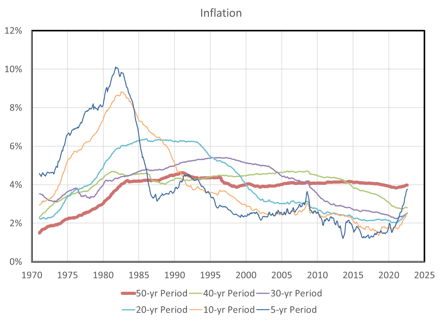
[You can see why the Fed has been scrambling to kill inflation. It’s 20-30 year reputation is on the line! That big blue line bubble in the 70s and early 80s was a mess for politicians. Ask Jimmy Carter about the “Misery Index“.]
So from the above, and for planning purposes, using a 4% inflation rate is not a bad guess, either.
What this means is that, long term, we can only expect about a net 2-3% (6-7% minus 4%) growth rate in our investments if we are sufficiently diversified. Getting that diversification as cheaply as possible is why Vanguard, originally, and now many other broad index funds have become so attractive in recent decades.
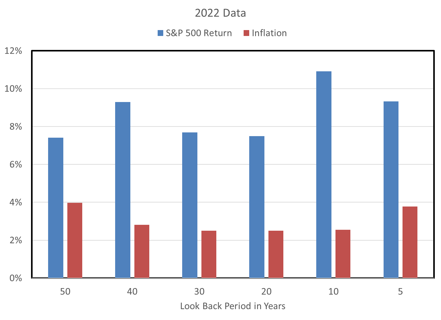
This point about long term planning factors is illustrated in the chart below that looks back from the most recent data across different time periods. Excluding the latest 5-year period, the longer the period we look back over, the closer the gap between stock returns and inflation.
Since most of us don’t own working crystal balls to forecast the 5- or 10-year stock market performance, one needs a pretty strong stomach to tolerate the rise and fall of prices (stock or supermarket) that might suggest dabbling in individual stocks, especially small or medium size businesses with little diversification themselves.
I found this analysis interesting, and a good reminder to keep dollar-cost averaging into cheap index funds. (Again, not advice, just my personal choice.) Even, and especially, in these ups and downs.
If you liked it, leave a comment. I welcome your thoughts.

You must be logged in to post a comment.